Let’s talk about colour!
Written in 2021 but all about bringing colour into your interior, so dive in below!
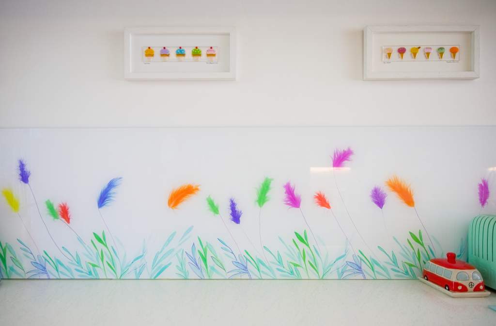
Decorating with colour can be transformational on all sorts of levels, and there’s real enjoyment to be had when you bring it into your home. With a new Pantone ‘Colour of the Year’ on the block (more on that later), this feels like a good time share my experience and tips for colouring your interior. They work for fitted features, like a Splashback; or apply to soft furnishings, paint and more.
A Note on Decorating with Colour
Designing with colour for kitchens and bathrooms is what I spend 99.9% of my time doing, so I consider myself pretty colour confident. You can be too, with just a few pointers. Adding some into the rooms you love most will really bring another dimension to the whole experience of how you live.

My top 5 tips for decorating with colour:
1.Think about how different colours makes you feel? Happy, calm, joyful, grounded? Colour will impact the day to day experience of any room so opt for those that reinforce the atmosphere you want to create.
2.Be authentic. For example, my Splashback designs are generally found in Kitchen and Bathroom interiors; two of the most used rooms in your home. Whatever you choose, you’ll be seeing it a lot, so you need to believe in what you’re choosing. Colours that suit one person will be completely wrong for another, it’s such a personal thing.
3. Be colour aware. Are you only considering a colour scheme because it’s the latest interiors trend? Glossy inspo is great but you can also get to know ‘your colour/s’ in pretty much everything you do. How do the everyday places you love look? Do you always go for certain colours in your food choices? What is it about that restaurant that always makes you feel ‘at home’..?
4. Of course, there’s nothing wrong with looking to interiors magazines, Instagram and Pinterest. I mean, who doesn’t love a bit of ‘magazine chic’? This year’s ‘Colour/s of the Year’ from Pantone is a great example of where you might see a colour combination you’re inspired to try in your own home.
Colour of the Year
‘Ultimate Gray’ and ‘Illuminating’ have been chosen by Pantone as a marriage of colour, conveying a message of strength and hopefulness that is both enduring and uplifting. Cheery yellow combined with a versatile shade of grey is a practical combination and effective use of complementary colours. ‘Enduring’ (can you live with it) is a good point to keep in mind when investing in accessories or fixed features like a Splashback. I definitely design with continued enjoyment in mind.
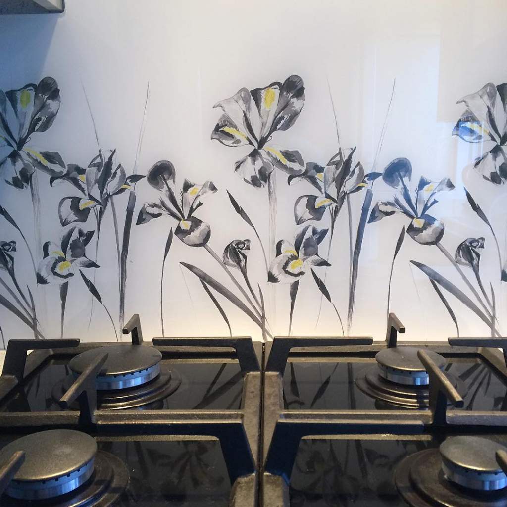
‘Iris in Stone’ and ‘Iris in White’ are good examples that showcase Pantone’s sophisticated palette. ‘Iris in Stone’ unites soft greys with warm yellow accents; it’s shows it’s possible to be both colourful and considered. Incorporating yellow, the design brings a warmth to rooms, which cold bathrooms love. ‘Iris in White’ includes a hint of colour for an accent, adding subtle interest to this neutral bathroom.
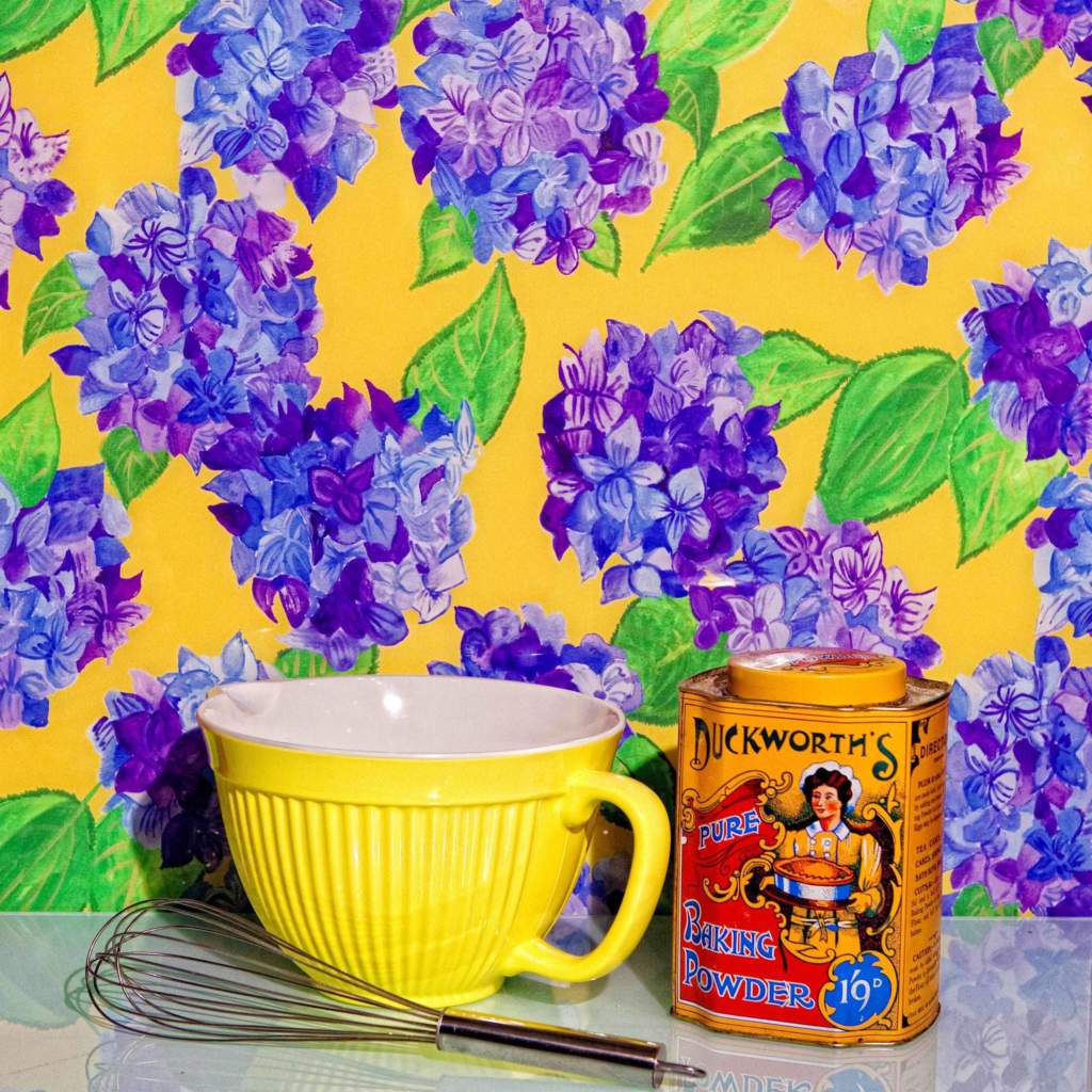
Blue Hydrangea is at the other end of the spectrum, and it really packs a yellow colour punch. The design is particularly suited to contemporary retro styling and a real feature around which to consider the rest of your room.
5. Decorating with Colour…What Do You Like?
I’m naturally drawn to yellow (it’s just a coincidence it’s Colour of the Year). You’ll see it in my own home and spot it in my business logo! Using it for decoration makes a space feel welcoming and happy. Everywhere I’ve lived has become a home because of it. Because I love it. ‘Colour/s of the Year’ might not be for you, but there’s a suitor out there!
Call me for a Colour Chat!
Splashback Consultations with me are a great chance to explore ideas that will add colour to your kitchen or bathroom in a considered way. It’s all very relaxed, free and no obligation so just get in touch to book me in. A chance to get to know you and your interior over a cuppa…and see if we can find a match!
Did you like this post?
We have a regular newsletter full of ideas with Emma Britton Decorative Glass, lifestyle inspiration and occasional offers for readers. Scroll to the bottom of the homepage to sign up for a colourful inbox read.